Note this is about a future release of APEX and the final release may differ from what I describe.
Last month I gave two talks at the NL.OUG APEX World conference. The first was part of the APEX 18.1 new features presentation with Anthony and Shakeeb. There I showed an app that demonstrated new region features. I said I would make the app available. Now that apex.oracle.com has been upgraded to 18.1 pre-release you have somewhere to try it out. You can download New Region Features (18.1). Note: You must install the Sample Interactive Grids app and Sample Charts app first because it uses sample data from those apps.
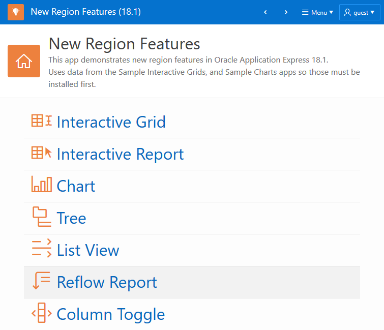
Besides providing sample pages that let you explore the new features of each region type there are a few techniques in this app that may be of interest.
(1) The app icon was added to the title bar by adding <span class="app-icon"></span> to the text logo and adding some CSS styles to the application file (NewRegion.css).
(2) Each sample region page has a What’s New button that opens a popup dialog. This is an example use case for the inline popup I showed how to create in my previous blog article. Here I didn’t follow my own advice for naming the region. I recommend you follow the instructions in the previous blog especially related to using a unique prefix for the region template identifier.
The breadcrumb bar is defined on the global page. Each page only needs to set the title and icon in a before header computation. This makes each page consistent and easier to maintain.
(3) This application has interesting navigation needs due to it being used in a presentation. I wanted to move through the pages in order but also allow for random access. I didn’t want navigation taking up extra room so that more room is left to show off the regions. I didn’t want the traditional top or side navigation. I did however want to leverage the main navigation menu list. To accomplish this I played some tricks with the Desktop Navigation Bar list and Navigation Bar template. The template creates either button style links or menu buttons. The next and previous button couldn’t be static links because they depend on what page you are on. For the menu I wanted to use the Desktop Navigation Menu list. So I put nothing but a separator under the menu list item. This is enough to make it a menu button. The actual, nearly empty, menu never gets used. I added specific CSS classes to each item so that I could target them with fix up code from the global page.
For the main navigation menu I added a Menu Popup list region on the global page (0). The list is Desktop Navigation Menu. I gave it a static id of “nav” so I can reference the menu widget as “nav_menu”. Also on the global page there is a page load dynamic action that swaps in the desired menu on the navigation bar menu button.
$(".nav-menu > button").attr("data-menu", "nav_menu");
This is all it takes to move the main navigation list to the nav bar. Why not just put the main menu navigation into the the Desktop Navigation Bar list? You could do that but there are some limitations. First all the create page wizards prompt you to add the new page to the navigation menu providing you have not turned it off by setting Navigation Menu: Display Navigation to No. Second the Navigation Bar Template does not support sub menus. It turned out I didn’t need sub menus but if you ever do you can use this technique to attach a popup menu list region to a nav bar menu button.
The next and previous buttons also needed some fixing because I want them to only be icons. This is done in the same paged load dynamic action on the global page.
The code that implements the next and previous button navigation is in a dynamic action on the global page called “next or prev nav”. It finds the next or previous page by looking at the hrefs in the menu items. Study and step through the code to see how it works. The nice thing about this is that you don’t have to maintain next and previous links on each page. It is all in one place; the main navigation menu. No matter how you change the menu the next and previous buttons keep working with no changes needed.
(4) The Interactive Grid page has some dynamic actions to give some ideas for what can be done with the new dynamic action events. One updates a chart region when the grid is saved. The other shows or hides a region depending on if the grid is in edit mode. Previously you would have to use custom events to define dynamic actions for these Interactive Grid events.
(5) The Tree page Explorer tab shows some complex behaviors that can be implemented with the Tree region. Check out the tree Advanced: JavaScript Initialization Code, dynamic actions and global functions on this page to see how check boxes, search, and the details region are implemented.
In the future I hope to share an improved version of the app I demonstrated in my other APEX World session on APEX JavaScript APIs.