Last updated on Tuesday, December 24, 2019
At Kscope 19 in Seattle and APEX Connect in Bonn I presented a beginners session on interactive grid where I demonstrated an app that gives a guided tour of the interactive grid features. As promised I’m making the app available. It uses the same data as the Sample Interactive Grids app so make sure that is installed first. Then download the Interactive Grid Tour. If you are new to interactive grid this app is a good introduction to what it can do. It takes a different approach compared to the Sample Interactive Grids app in that it guides you through just about all of the built-in capabilities with a series of popup notes.
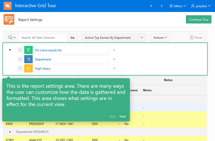
Even if you are already an expert on IG the app may still have some value for you. Have you ever wanted to make sure users are aware of some new feature in your app. You have probably seen apps that do this. After an upgrade they will popup a note or notes that point out some new things. There is a reusable widget in this app that does just this.
[Update 24-Dec-19 there is a newer version of the showMe widget that works for 19.2 that you can find here]
Here’s the scenario: You have a popular app that has been in use for years. The users are very familiar with it. You have added two new features that they get to from buttons on the home page but you are concerned that users won’t notice because their navigation patterns are so ingrained. You want a popup to educate them about the new features when they use the app. This is what the showMe widget is for. Making use of this widget will require some JavaScript and CSS skill.
Here are the steps to make use of it in your own apps:
- Download the tour app and install it. Run the app to get a feeling for what showMe can do.
- Go to Shared Components > Application Files and extract (download) the
IGtour.cssandshowme.jsfiles. - The styles needed for
showMewidget are in theIGtour.cssfile. Copy all the rules after the “Show-me classes” comment into your application’s CSS file. What, your app doesn’t have it’s own CSS file? Hmm. Must be a very straight forward app. No problem. You can add a new CSS file (recommended) or simply copy the rules into the page CSS inline attribute on any pages whereshowMeis going to be used. - Go to your app where you want to add a tour. Or create a new app just to try this out.
- Go to Shared Components > Static Application Files. Upload the
showme.jsfile and the file where you added the CSS rules. I’ll assume it is calledapp.css. - Now go to Shared Components > User Interface Attributes > Desktop.
In JavaScript File URLs enter:#APP_IMAGES#showme.jsIn Cascading Style Sheets File URLs enter:
#APP_IMAGES#app.css.If you added the CSS rules to an existing file that is already loaded then this last step isn’t needed. Note: If you are only adding a tour to one or a few specific pages then you could load these files just on those pages. The general idea is that these two files need to be loaded on any page where you want to give a tour of your app features.
- Go to the page where you want to add the tour. I’m going to assume that there are two buttons on this page that represent the new features to call out and their static ids are “feature1” and “feature2”. You can substitute any jQuery selector you like in the tour steps and even add more steps (See step 7).
- Add an inline popup region to the page. Add a Static Content region to the Inline Dialogs position and set the Template to Inline Popup. Set the title to “Tour”. The title won’t be seen. Set the templates options: Remove page Overlay and Set Dialog Size to None. The
showMewidget uses the popup functionality but doesn’t include it so that you can customize the popup to fit your needs. Note: you won’t use theapex.theme.openRegionAPI with this popup region. - The tour is driven by markup added to the popup. Add the following to the popup region Source Text attribute.
<ul class="show-me">
    <li data-element="#feature1">
      Press this button to make a random person on the Internet a little happier today.
    </li>
    <li data-element="#feature2">
      Press this button to be <em>5% more</em> productive.
    </li>
</ul>
The
show-meclass causes this list to be turned into ashowMewidget automatically when the page loads. Each list element is a step in the tour. The content of the list element is shown next to the element identified by the jQuery selector indata-element. Other attributes used to control the showMe tour steps include:data-name, data-position, data-zindex, data-width, data-height, data-url. The position attribute controls the popup position relative to the element and can be one of “below” (default), “above”, “left”, “right”, “inside”, and “center”. - Add a dynamic action to start the tour when the page loads.
Name: start tour
Event: Page Load
Add one Execute JavaScript Code action and Add this code:$(".show-me").first().showMe("nextStep"); - Add a Next button to the Next button position in the popup region created in step 6. Set the button name to TOUR_NEXT and the label to Next. Add a dynamic action to go to the next step of the tour. This looks a lot like the one in the previous step.
Name: next step
Event: Click
Select Type: Button
Button: TOUR_NEXT
Add one Execute JavaScript Code action and Add this code:$(".show-me").first().showMe("nextStep"); - Now run the page and you should see the first tour popup. Click next to see the next tour step.
See the Interactive Grid tour app for more advanced uses. It defines a number of actions and dynamic actions on the global page (page 0) because the tour is used throughout the app. The actions let you use keyboard shortcuts. The showMe step options doBefore and doAfter let you handle advanced situations where the state of the page needs to be set before the step can be shown such as selecting a tab or expanding a region. The logic to open a menu so that a tour step popup can point to a menu item is complicated and not very robust. The code for it is in the IGtour.js file.
It would be easy to add a “don’t show me this again” checkbox to the popup and save that state as a hidden page item backed by a user preference. The page load DA that starts the tour would only start it if the user hasn’t checked the box. There are many other possibilities for starting or continuing the tour.
Read the showme.js source code comments to learn about the options and methods it supports. You will probably want to modify the CSS for the popup for example to change the colors.
Because the showMe widget is driven by simple list markup it would not be unreasonable to create an APEX list template for it. I did not do this because the list is specific to a given page, contains sometimes complex jQuery selectors, and doesn’t leverage app URLs much. So I found it much more convenient to simply author the list markup right on the page.
When I created showMe I wanted to leverage the popup widget as much as possible. One thing that was missing was the callout – that little triangle that points to the element that the popup is related to. So I added the callout functionality as part of showMe. Shakeeb and I liked it so much that we added it to the APEX menu and popup widgets and hopefully this will be in 19.2. So this showMe widget may need to be changed when the popup has its own callout implementation.
If you add showMe to your app I would be happy to hear any feedback you have.
[…] by Patrick Wolf. This Oracle Tips and Tricks article may be worth a read. Finally, there’s this rather comprehensive look at Interactive Grids by John […]
In reference to my last reply, it seems that initially, a scrollbar appears on the right. When I click the button, the scrollbar disappears and the button is items including the button is shifted to the right. I’m using Google Chrome. As a workaround, how do I not display the border around the button.
It works great! I use a button as New Features, so when the user clicks on it, it will ist all the new features of the release . The only issue so far I have is that the button that uses the showme seems to have the border around the button shifted . It seems the button is moved to the right when I click the button. How can I correct the border issue.
hello,
Thanks for the answer, sorry but yes i’m installing on 19.1 with Sample Interactive Grids app installed first.
And I also tried on apex.oracle => same errors 🙁
@apex user. It worked fine for me when I installed it on apex.oracle.com just now. Are you sure you are installing into 19.1 and have the Sample Interactive Grids app installed first?
Hello
Thanks for the application gut I have errors at import :
3 errors have occurred
Build Status must be specified.
Parse As Schema must be specified.
File is not a valid Application Express application export file.
Further to this, it would be handy to make this data available to non-developers, so others have ability to maintain the wording, not necessarily the selectors. So ability to link to shared LOV would be beneficial.
When I first saw this post, I immediately wondered how de-coupled this is from the IG. ie – are you just using IG as an example because that’s your bag.
I’ve been meaning to have a play with similar functionality that DanielH created with his guided tour plugin, so I thought I’d play with both.
https://github.com/Dani3lSun/apex-plugin-guidedtour
His, by virtue of already being in a plugin, is an action list of selector/text pairs, and works as described.
Your solution drives this through a HTML region of essentially the same data, maybe with a few extra features. If this was converted to a plugin, you may reach a similar format – or maybe you could supply data set with shared LOV.
I think a “show on first view” would be essential.
We might have a new set of users added soon, and first time guidance would help.