Last updated on Friday, September 28, 2018
Note this is about a future release of APEX and the final release may differ from what I describe.
[Update: This post has been updated with information for 18.2]
This article will show how to add an Inline Popup region in APEX 18.1 [Update: and 18.2]. It is similar to the existing Inline Dialog region. If you have not used an inline dialog before you can learn how from the Universal Theme sample app.
A popup is different from a dialog in these ways: It is always modal, does not have a title bar and cannot be resized or moved. It may have buttons that close it but it also closes when you click or touch outside of it or press the Escape key. It may be positioned near the artifact that caused it to open. Popups are commonly used in mobile apps.
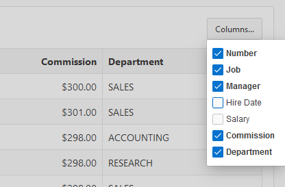
Late in the APEX 18.1 release a popup widget was created. It was needed because of the Column Toggle Report region that was ported from jQuery Mobile to work with jQuery UI and the desktop user interface. Here is a picture of what the column toggle popup looks like. You can put anything in a popup. In this case it contains a set of checkboxes.
JQuery Mobile has a popup widget but there isn’t one in jQuery UI. The simplest way to create such a widget is to extend the jQuery UI dialog widget, which is what I did. The APEX popup widget is very small and simple. Currently it is only used by the Column Toggle Report region but I think in the future we will use it for more things. I used it in an app that I showed at the AEPX World conference last month.
In a previous article about IG Cookbook I described a Custom Popup plug-in where I approximate a popup using an inline dialog region. In the future I plan to rework that plug-in and cookbook example using this new popup functionality.
I hope that a future release of APEX will include an Inline Popup region. Until then here is how to add your own. This assumes you are using Universal Theme. You will have to adjust the details if you are using some other theme.
- Make a copy of the Inline Dialog template.
- Go to Shared Components > Templates and find the Inline Dialog template.
- Click the Copy button.
- Enter “Inline Popup” for the name.
- For the Identifier add a prefix (with your company name or initials for example) to the default to reduce the chance of a future conflict. For example MY_INLINE_POPUP.
- Open the Inline Popup template you just created.
- Delete the Modal, Draggable, and Resizable template options. A popup is always modal and not draggable or resizable. You can also remove the Auto Height option since it doesn’t work. [Update: In 18.2 you can leave the Auto Height option.]
- Add a new Template option to group Dialog Size named “None” with CSS Classes
js-dialog-nosize(just because it can’t be blank). This option causes no height or width to be set. This is because it is common for a popup to only be as big as its content. - In the Definition: Template attribute remove
js-regionDialogfrom the class of the second div. The resulting line should look like this:<div id="#REGION_STATIC_ID#" class="t-DialogRegion #REGION_CSS_CLASSES#" #REGION_ATTRIBUTES# style="display:none" title="#TITLE#">[Update: For 18.2 don’t remove class
js-regionDialogbut rather rename it tojs-regionPopupThe resulting line should look like this:<div id="#REGION_STATIC_ID#" class="t-DialogRegion #REGION_CSS_CLASSES# js-regionPopup" #REGION_ATTRIBUTES# style="display:none" title="#TITLE#">]
- [Update: For 18.2 skip this step. The Execute when Page Loads attribute should be empty.] In Execute when Page Loads enter:
var p = apex.jQuery("##REGION_STATIC_ID#", apex.gPageContext$), parent = p.attr("data-parent-element"), size = /js-dialog-size(\d+)x(\d+)/.exec( p[0].className ), o = { autoOpen: false }; if ( size ) { o.width = size[1]; o.height = size[2]; } if (parent) { o.parentElement = parent; } p.popup(o); - Click Apply Changes.
One technical detail to point out about initializing the popup from the region Execute when Page Loads attribute is that it affects the timing of when the region is initialized. This is a difference compared to the Inline Dialog template. Notice that Inline Dialog has no JavaScript code defined. That is because the initialization code is in the core APEX file theme.js. An inline dialog region will initialize before this inline popup region. This is unlikely to be an issue but you may run into trouble if you try to call popup methods from on page load code because the region has not yet been initialized. If we ever do have a built-in Inline Popup region it will probably be initialized like the dialog region. [Update: In 18.2 this paragraph doesn’t apply. Now the theme.js module initializes both inline dialog and inline popup regions.]
Now that you have defined the region template it is time to put it to use. This is similar to how you use an inline dialog region. For the most part you just change references from dialog to popup in any JavaScript code.
- Add a Static Content region to the Inline Dialog page position.
- Change the template to Inline Popup.
- Open the template options and choose size small.
- You can put all kinds of things in the region. Lets start simple by
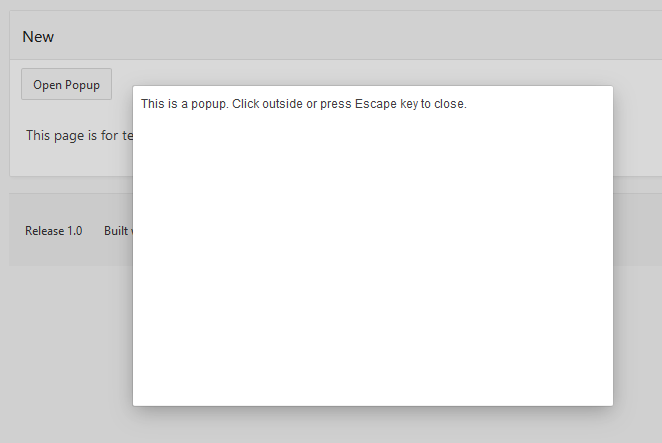
just adding some static text in the Source: Text attribute. Enter:
“This is a popup. Click outside or press Escape key to close.”
Now you just need a way to open the popup. This is easy to do. One common way to open a popup is in response to the user pressing a button.
- Add a button to the page somewhere.
- Add a dynamic action to the button for the click event.
- The dynamic action should have one Execute JavaScript Code action.
- Enter the following code:
$(this.affectedElements).popup("open"); - Under Affected Elements set the type to Region and choose the popup region you previously created.
[Update: In 18.2 there are new APIs to open inline popups or dialogs.]
Now run the page and click the button. It should look something like this.
Note that the above open code uses popup("open") rather than dialog("open"). To close the popup you would use popup("close"). If you are going to listen to any events such as open or resize remember to use popupopen and not dialogopen.
To have the popup positioned under the button just give the button a Static ID such as “btn1” and then in the Inline Popup region Advanced: Custom Attributes enter data-parent-element="#btn1". Currently it is a limitation that you can’t change the popup parentElement option after the widget is created. However, if needed you can update the position option. [Update: in 18.2 this limitation is removed.]
You can easily add buttons to the popup that close it. Add a button to the region and give it a dynamic action with an Execute JavaScript code action with the following code:
$(this.affectedElements).popup("close");
Remember to set the affected elements to the inline popup region. If you don’t want to use this.affectedElements you could give the inline popup region a Static ID such as “myPopup” and then change the code to $("#myPopup").popup("close");.
To make the popup no bigger than needed set the Dialog Size template option to “None”. Depending on what you put in the popup you may have to use custom CSS rules to adjust the padding or heights of things to avoid scroll bars. The popup dialogs have class ui-dialog--popup to allow targeting them specifically. For example I think there is too much padding around buttons for a popup so I added this rule.
.ui-dialog.ui-dialog--popup .t-ButtonRegion-buttons {
    padding: 2px;
}
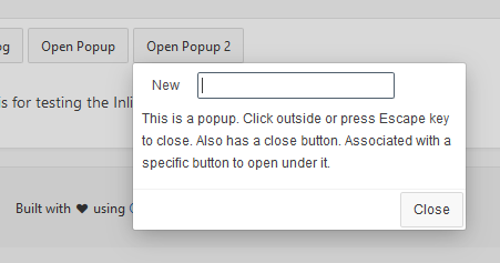
Here is a slightly more interesting looking popup. It has a Close button and is positioned under the button.
Inline popup or dialog regions are easy to create, open, and close but doing interesting things with them can get complicated. If the popup or dialog will be used to enter or edit data use copy in, copy out. Just before or on open copy data from the main page or fetch data from the server. When the “OK” button is pressed copy data back to the main page and/or save to the sever. Think of the dialog or popup like a function that the main page passes data into and on close it returns its results to the caller. The dialog should not know about the main page.
Other details that may be of concern are handling dialog resize so that the contents of the dialog are resized. This can be less of an issue for popups because they don’t resize but there may still be some initial sizing to do. Another issue is that the dialogs/popups are initially hidden which can cause issues for some region types that need to be visible when initialized. I have written about this before. I may write about what it takes to put an IG in a dialog/popup some day. [Update: In 18.2 this is no longer a problem.]
Passing data in and out of dialog pages is not without its own challenges but modal dialog pages tend to be simpler. The big advantage of inline dialogs and popups is that they open up much quicker. They are much lighter weight because they don’t open another APEX page in an iframe. Give them a try.
Cheers John, can’t wait to give this a go, II can already think of a number of uses.
In 18.1 I have noticed a possible bug with inline dialogs, whereby they don’t seem to touch scroll when rendered to a mobile size screen. ?