Last updated on Friday, March 20, 2020
Out of the box APEX provides a number of useful, declarative, good looking navigation options. There is the side navigation menu tree and the top navigation menu bar, top navigation tabs, and new in release 20.1 top navigation mega menu.
In this series of articles I will be discussing some advanced use cases primarily related to side navigation. These are based on customer requests and my own musings. The sample app for part 1 was created with the upcoming 20.1 APEX release but the techniques should work on previous releases. On apex.oracle.com there is currently a pre-release of 20.1 where you can try out the app (enter any username). You can also download the app and import it into your own workspace on apex.oracle.com or your own 20.1 instance once available.
This topic interests me because, although I don’t work on the global navigation features in general, I created the treeView widget used for side navigation and the menu widget used for top navigation. I have written about navigation topics before but exclusively related the menu widget. In More APEX Menu Fun I wrote about how to create a menu bar with custom markup (mega) popup menus. Before there was a built-in mega menu option I showed how to create one in APEX Media List Mega Menu. I then refined the mega menu example and included more custom content menu examples in All The Things That Pop Up.
Background
Just to make sure everyone is up to speed on the APEX global navigation menu functionality here is what it is and how it works.
Most web apps have a common consistent place in the UI with links to the various pages that make up the app. Although this navigation UI appears on nearly every page you don’t want to have to define it on every page.
Here is how APEX handles this. Navigation in general uses Lists – a kind of shared components. One list is designated the “navigation menu”. APEX helps maintain this list by giving you the opportunity add new pages to it as part of the create page wizard. To edit the list go to Shared Components > Navigation: Navigation Menu.
Lists contain all the metadata necessary for rendering HTML anchor elements. But the actual rendering is controlled by a list template – also a shared component and part of a theme. In this way the same list can look like a simple list of links, cards, a badge list and others. In practice, because of template specific attributes, a list is created with a specific template in mind.
The Universal Theme provides a number of list templates. Some templates are designed specifically for the purpose of global navigation menus. These have either “Side Navigation” or “Top Navigation” in the template name. If you try to use these lists templates for something other than global navigation the result will be disappointing at best.
You configure global navigation under Shared Components > User Interface Attributes: Navigation Menu. The Display Navigation switch lets you turn if off altogether in case you have an app with very few pages and no need for global navigation or want to provide your own custom navigation solution. I did this in my mega menu example because it used the navigation bar instead.
This is where you specify which list is the Navigation Menu List. A default list called “Desktop Navigation Menu” is created and set as the Navigation Menu when you fist create your app. (The word desktop in the name is a carry over from when there was distinct mobile and desktop UIs.)
There are two choices for where on the page the navigation goes; Top and Side. Where exactly these go in the page markup is controlled by the page template. Page templates that support global navigation include the substitutions #TOP_GLOBAL_NAVIGATION_LIST# and #SIDE_GLOBAL_NAVIGATION_LIST#.
Once you choose where on the page the navigation goes you have to choose a list template. Here you must choose an appropriate template according to the position. Trying to put a side navigation tree in the top position or a top navigation menu in the side position results in undefined behavior. There is no error or warning. The result is most likely no visible/functional navigation. Fortunately APEX sets appropriate defaults and the template names make it very clear what position they are intended for. After choosing a template you can set template options.
All the above settings can be overridden at the page level. See the Page attributes Navigation Menu section.
During server side page rendering the APEX engine renders the designated navigation menu list with the chosen template and puts it in either the top or side navigation substitution according to the chosen position. For the side navigation template the client side behaviors are implemented with the APEX treeView widget. For top navigation menu and mega menu templates the client side behaviors are implemented with the APEX menu widget. In both cases the server rendered list markup is consumed and turned into JavaScript data used by the widgets to do their own on demand rendering.
Experiment 1
This first experiment is motivated by noticing that there are multiple templates that work in the top position but only one for the side position and wondering what else could go there. I started with a new Universal Theme app from the create app wizard with just a couple of empty pages in the navigation menu.
My first naive attempt was to simply change the Navigation Menu List Template to the “Cards” list template. This resulted in a complete mess. Looking at where the page template puts the #SIDE_GLOBAL_NAVIGATION_LIST# substitution token and the Side Navigation Menu template it is clear that Universal Theme expects the list template to provide a wrapping div for the side navigation. The page template also has some JavaScript code to add a class to the body. (You may wonder why there is no JavaScript code in the template to create the treeView widget like the Top Navigation Menu template has code to create the menu. The reason is that the code to create the treeView is in the theme42.js JavaScript file.)
At this point it was clear that I needed to create a specific template. This wasn’t really a surprise. I copied the Cards template to a new template called “Side Cards Nav”.
To the beginning of the Before List Entry template I added:
<div class="t-Body-nav" id="t_Body_nav" role="navigation" aria-label="&APP_TITLE!ATTR.">
And added a closing div to the end of the After List Entry template:
<div>
I also added the same JavaScript code from the Side Navigation Menu template:
$('body').addClass('t-PageBody--leftNav');
I then change the Navigation Menu List Template to this new “Side Cards Nav” template. This worked pretty well. Some minor CSS rules were needed to make the cards look nice. Currently CSS rules for list templates that are used in the top or side navigation positions cannot go in the template CSS Inline or File URLs attributes because these are never rendered (bug 29418372). The workaround, and general best practice, is to put the CSS rules in an application CSS file. I’m not going to go into the CSS details for this example. It is mostly simple stuff like making the card width 100% and setting padding. Take a look at the CSS file app1.css.
This helped a great deal but the show/hide (toggle) side bar navigation behaviors were broken. Universal Theme (UT) ties many behaviors to the existence of the “#t_TreeNav” treeView widget element. The treeView widget and the toggle side bar behavior are deeply intertwined. Here are the things that UT does in response to the existence of “#t_TreeNav”:
- An internal determination if the screen “is small”
- A check to disallow top menu and side menu
- Initialize the treeView widget and “toggleWidgets” that show or hide the side bar
To have the standard toggle navigation side bar behavior but without the normal side navigation template there are 2 options. Either have a hidden treeView Widget to trick UT into enabling the toggle side bar behavior or write your own toggle behavior. The second option seems daunting. I tried the first option by doing the following to my “Side Cards Nav” list template:
Add
<div id="t_TreeNav" style="display:none"></div>
between the t_Body_nav element and the cards ul element.
Add file url:
#IMAGE_PREFIX#libraries/apex/#MIN_DIRECTORY#widget.treeView#MIN#.js?v=#APEX_VERSION#
This worked but it loads the treeView widget for no reason. In addition the cards UI as-is doesn’t deal well with being very narrow (when the side nav is collapsed). So I backed out these changes and decided to just get rid of the toggle side bar behavior. The Expand/Collapse Navigation toggle button was hidden with CSS in the app1.css file.
Cards in the side bar have no need for some of the template options so I removed template options for number of columns, and span horizontally. This leaves only Stacked and Float options and I’m not sure there is any real difference. There may be some other template options that you could remove or modify.
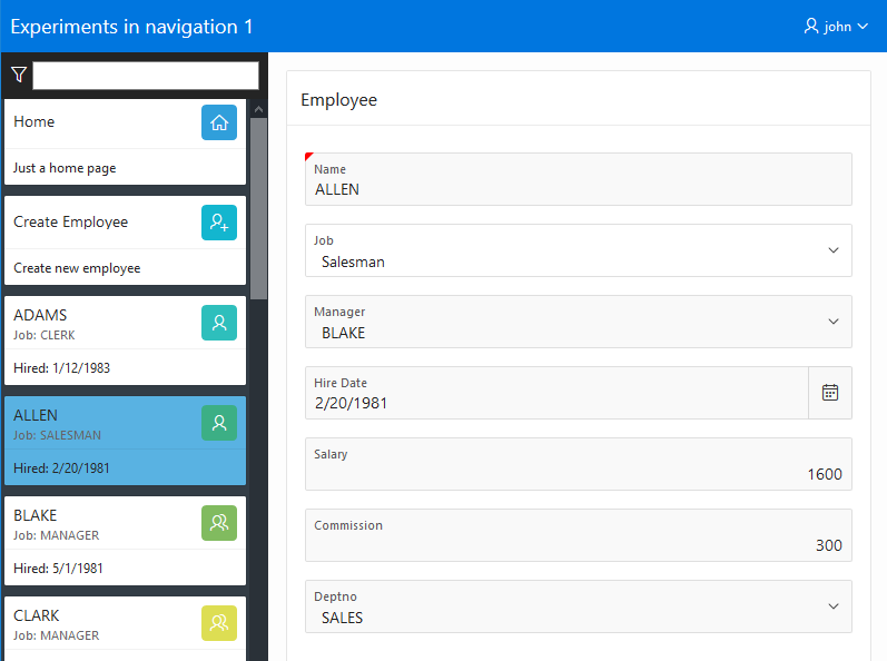
I thought a good use case for this card navigation would be to show instances of things to view/edit. So I created a dynamic list of employees from the EMP table along with a couple static cards. I called the list “Dynamic Nav Emp”. The SQL query is:
[Update 17-Mar Thanks to Patrick Wolf for pointing out some improvements to my SQL code. I should be using the get_url function for example: apex_page.get_url( p_page => '1' ) target,. Also, in a SQL query bind syntax is more performant than the V function. So if you do need to, use :APP_ID rather than v('APP_ID') for example.]
with nav as (
select
    '1' o1,
    'Home' label,
    'f?p='||v('APP_ID')||':1:'||v('APP_SESSION')||'::'||v('DEBUG') target,
    case
        when '1' = v('APP_PAGE_ID')
        then 'YES' else 'NO'
    end as is_current,
    'fa fa-home' image,
    'Just a home page' a1_desc,
    null a2_info,
    null a3_inits,
    null a4_list_cls,
    null a5_lnk_attr,
    null a6_color,
    null a7_sub_title
  from dual
union all
select
    '2' o1,
    'Create Employee' label,
    'f?p='||v('APP_ID')||':3:'||v('APP_SESSION')||'::'||v('DEBUG') target,
    case
        when '3' = v('APP_PAGE_ID') and v('P3_EMPNO') is null
        then 'YES' else 'NO'
    end as is_current,
    'fa fa-user-plus' image,
    'Create new employee' a1_desc,
    null a2_info,
    null a3_inits,
    null a4_list_cls,
    null a5_lnk_attr,
    null a6_color,
    null a7_sub_title
  from dual
union all
SELECT
    '3' o1,
    ENAME label,
    'f?p='||v('APP_ID')||':3:'||v('APP_SESSION')||'::'||v('DEBUG')||'::'||'P3_EMPNO'||':'||EMPNO target,
    case
        when '3' = v('APP_PAGE_ID') and v('P3_EMPNO') = EMPNO
        then 'YES' else 'NO'
    end as is_current,
    case when JOB='PRESIDENT' then 'fa fa-certificate'
         when JOB='MANAGER' then 'fa fa-users'
         else 'fa fa-user' end image,
    'Hired: '||HIREDATE a1_desc,
    null a2_info,
    SUBSTR(ENAME, 2) a3_inits,
    null a4_list_cls,
    null a5_lnk_attr,
    null a6_color,
    'Job: '||JOB a7_sub_title
  from emp
)
select
    null list_level,
    label, target, is_current, image,
    null image_attr, null image_alt,
    a1_desc, a2_info, a3_inits, a4_list_cls, a5_lnk_attr, a6_color, a7_sub_title
from nav
order by o1, label
To make use of this newly created dynamic list for global navigation I went to the User Interface Attributes and choose it from the Navigation Menu List list.
Now that I had a list of employee cards in the side nav I thought it would be nice to add some client side quick filtering. There is a handy widget in APEX called filterable. This came from jQuery Mobile and is used internally by the APEX List View and Facets regions. It is not documented but you can learn how to use it from the jQuery Mobile documentation. This required a little extra markup and some JavaScript in the “Side Cards Nav” list template.
Putting everything together now the template Before List Entry looks like this:
<div class="t-Body-nav" id="t_Body_nav" role="navigation" aria-label="&APP_TITLE!ATTR.">
<div class="t-navfilterArea">
 <label for="t_navFilter"><span aria-hidden="true" class="t-navFilterIcon fa fa-filter" title="&APP_TEXT$CARD_NAV_FILTER_LBL."></span>
 <span class="u-vh">&APP_TEXT$CARD_NAV_FILTER_LBL.</span></label>
 <input id="t_navFilter" type="text">
</div>
<div class="cardsWrapper">
<ul class="t-Cards #COMPONENT_CSS_CLASSES#">
Add the needed widget file to the JavaScript File URLs
#IMAGE_PREFIX#libraries/apex/#MIN_DIRECTORY#widget.filterable#MIN#.js?v=#APEX_VERSION#
The Execute when Page Loads JavaScript code looks like this:
var $ = apex.jQuery;
$('body').addClass('t-PageBody--leftNav');
$("#t_Body_nav .t-Cards").filterable({input: "#t_navFilter"});
$("#t_Body_nav .is-active").first().each(function() {
    this.scrollIntoView();
});
/* just a little bit of responsive behavior */
$("#t_Button_navControl").click(function() {
    $("#t_Body_nav").toggleClass("is-active");
});
You can see there is just one line of code to enable the client side filtering. While doing some testing I noticed that there was an undesireable side effect on small screens due to the normal UT responsive behavior. I realized that I would need to sometimes have the side nav toggle button after all. I did something quick and dirty. Take a look at the above JavaScript code and the following CSS rules from app1.css.
.t-Body-nav {
    display: none;
}
.t-Body-nav.is-active {
    display: flex;
    z-index: 2000;
    background-color: #242424;
}
@media only screen and (min-width: 641px) {
    .t-Header-controls {
        display: none;
    }
    .t-Body-nav {
        display: flex;
    }
}
This is the end of the first experiment. There may not be much demand for cards in the side navigation but the point of the experiment was to explore what it takes to put something besides a tree there. It may give you ideas for other types of navigation such as an accordion or something else.
In the next part of this series I’ll look at dynamically loading sub trees.
Hi John,
great post, reminds me a bit of my similar problems while building my first plug-in “SearchNavigationMenu” witch by the way still working from version 5.0 on…
Example : apex.oracle.com/pls/apex/f?p=111583
Since before 20.1 we didn’t have IG URL-based filtering I’m looking finally to upgrade my old and I may say messy plug-in.
IG URL-based filtering feels a lot like IR URL-based filtering… Only thing I can’t figure out without API documentation.
How to clear cache on IG, like for example on InteractiveReport CIR,RIR ?
In advance thanks for your replay and time….
Kind regards, Andrej