During a recent APEX office hours Sven Weller asked a very interesting question about styling top navigation menus. The question was elaborated on in this forum post. There are a lot of details in that thread but the short answer is the out-of-the box top navigation menu doesn’t allow arbitrary markup or individually colored menu items. However the menu widget has many features and here I will show how to create rich custom content menus like the following.
Menu bars, drop down menus, and popup menus have been around since the beginning of graphical user interfaces. There is value in consistency of look and feel so that users can immediately recognize and easily manipulate the menus. The APEX menu widget tries to follow as closely as possible the design guidelines for traditional desktop menus. This is why they don’t have icons in the menu bar and don’t allow different colors, etc. But in the wild west of web UI anything goes. As a result there are a number of bad web based menu designs and implementations. This isn’t to say that web designers haven’t come up with new effective UI; they have and some of the patterns have found their way back into desktop platforms. One of those patterns is the mega menu. There are a number of variations of mega menus and some are better than others. A nice thing about sticking with traditional menus is that you know they will be usable and accessible. For example the APEX menu fully supports keyboard navigation including typing characters to go to the next menu item that starts with that character.
To support mega menus, the APEX menu widget has a custom menu content option. I showed how this can be used to implement a custom popup mega menu but it also works with menu bars, which is the subject of this article. To be clear the menu bar itself does not allow custom markup but the drop down menus do. This way you get standard menu bar behavior such as right and left arrow key navigation, open on hover once opened, and the overflow menu on small screens. With custom content comes the responsibility to make sure that the drop down menu is usable and accessible but at least the basics like keyboard handling come for free.
Here are step by step instructions for creating an app like the one pictured above. It would be nice if there was an easy way to share a single template but the choices are to export a whole theme or a whole app. The steps seem long because I have to show all the template HTML but it is really quite simple and there is no new JavaScript. It is mainly just a new list template that is needed.
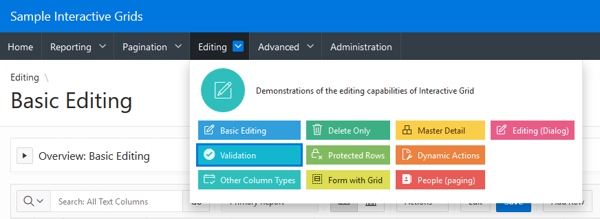
1. You will need an application to try this out on. I used the Sample Interactive Grids app because it already had interesting nested menus. It is a good idea to make a copy of the application.
2. Change the app to use top navigation. Go to Shared Components > User Interface Attributes > Desktop > Navigation Menu. Set Position to Top. For now leave the default list template Top Navigation Menu. If you run the app now you will see the normal APEX top navigation menus.
3. Copy the Top Navigation Menu template to a new template called Top Custom Menu. Go to Shared Components > Templates. Find the Top Navigation Menu and click the copy button. Then change the app to use this new template. Go back to the navigation menu settings from step 2 and change the List Template to the new Top Custom Menu. If you run the app again you will see that nothing has changed because we haven’t modified the template yet. The next few steps will modify the new template.
4. Edit the template. Go to Shared Components > Templates and click on the newly created Top Custom Menu. There are a number of changes to make so it can be helpful to check the Return to page checkbox.
5. This first change isn’t really necessary for the custom content menu but I think there is room for improvement in the built-in top menu template. I think that the menu bar should have a nice id like the side navigation tree does. The #PARENT_STATIC_ID# is not very useful when the list template is used for the navigation list (rather than a list region) as is intended for this template. At the same time the JavaScript code can be improved. It needs to use the new id and there is no need to check for apex.actions because it is always available now. I also think that the “NEXT” tabBehavior is more appropriate for this kind of menu.
Change the List Template Before Rows attribute to:
<div class="t-Header-nav-list #COMPONENT_CSS_CLASSES#" id="t_menuNav_menubar"><ul style="display:none">
Change the Execute when Page Loads attribute to:
var e = apex.jQuery("#t_menuNav_menubar", apex.gPageContext$);
if (e.hasClass("js-addActions")) {
  apex.actions.addFromMarkup( e );
}
e.menu({
  behaveLikeTabs: e.hasClass("js-tabLike"),
  menubarShowSubMenuIcon: e.hasClass("js-showSubMenuIcons") || null,
  slide: e.hasClass("js-slide"),
  menubar: true,
  menubarOverflow: true,
  tabBehavior: "NEXT"
});
6. Change the template markup. This is the most time consuming part especially when you are trying to figuring out the markup and style for the custom menus. The general idea is to use the menu markup data-custom="true" attribute on the top level list entries that have sub items. Then in the sub items we can put just about any markup we want. Here I choose to borrow some classes from the Universal Theme cards. Some of the summary information (icon and description) is placed in the top level list item even though it will show up in the drop down custom content menu. The data-icon attribute is removed from top level list items because, as the console debug warnings will tell you “Menu bar items cannot have icons.” No worries, the icon is put to good use in the custom content menu. In a later step attributes are defined for the #A06# description and #A07# color class.
Change the List Template Current attribute to:
<li data-current="true" data-id="#A01#" data-disabled="#A02#" data-hide="#A03#" data-shortcut="#A05#">
  <a href="#LINK#" title="#A04#">#TEXT_ESC_SC#</a>
</li>
Change the List Template Current with Sublist Items attribute to:
<li data-current="true" data-id="#A01#" data-disabled="#A02#" data-hide="#A03#" data-shortcut="#A05#" data-custom="true">
  <a href="#LINK#" title="#A04#">#TEXT_ESC_SC#</a>
  <div class="a-Menu-content t-Card">
    <div class="t-Card-icon force-fa-lg #A07#">
      <span class="t-Icon #ICON_CSS_CLASSES#"></span>
    </div>
    <div class="t-Card-desc a-Menu-item"><a href="#LINK#">#A06#</a></div>
Change the List Template Noncurrent attribute to:
<li data-id="#A01#" data-disabled="#A02#" data-hide="#A03#" data-shortcut="#A05#">
  <a href="#LINK#" title="#A04#">#TEXT_ESC_SC#</a>
</li>
Change the List Template Noncurrent with Sublist Items attribute to:
<li data-id="#A01#" data-disabled="#A02#" data-hide="#A03#" data-shortcut="#A05#" data-custom="true">
  <a href="#LINK#" title="#A04#">#TEXT_ESC_SC#</a>
  <div class="a-Menu-content t-Card">
    <div class="t-Card-icon force-fa-lg #A07#">
      <span class="t-Icon #ICON_CSS_CLASSES#"></span>
    </div>
    <div class="t-Card-desc a-Menu-item"><a href="#LINK#">#A06#</a></div>
Next are the sublist entries. These are simpler because the data attributes used to create a menu from markup don’t apply. The current menu indication isn’t supported so the current and non-current templates are identical.
Change the Before Sublist Template Before Rows attribute to:
<ul class="menu-items u-colors">
Note the use of Universal Theme classes like u-colors. This is used to assign a default color to each menu item.
Change the Sublist Template [Non]Current attributes to:
<li class="a-Menu-item">
  <span class="#A07# u-color"><a href="#LINK#" title="#A04#">
    <span class="#ICON_CSS_CLASSES#"></span>#TEXT_ESC_SC#
  </a>
  </span></li>
Change the Sublist Template [Non]Current with Sublist Items attributes to:
<li class="a-Menu-item">
  <span class="#A07# u-color"><a href="#LINK#" title="#A04#">
    <span class="#ICON_CSS_CLASSES#"></span>#TEXT_ESC_SC#
  </a>
  </span>
Change the Sublist Template After Rows attribute to:
</ul></div></li>
7. Add descriptions for the new attributes. Set #A06# to Description. The text of this attribute is shown at the top of the mega menu. Set #A07# to Color Class. This lets you specify the color of the menu item. If you don’t provide a color class then a default color is used just like the UT cards templates. Both of these attributes only apply to the sub list items. And the other attributes #A01#, #A02#, #A03#, and #A05# only apply to the top level list items.
That is the end of the template changes. If you run the page now you will see the drop down menus but they will look all messed up. This is because a number of CSS rules are needed to get the desired layout.
8. Add the needed CSS rules. Normally if you just have a few CSS rules you can add them to Cascading Style Sheet Inline attribute but there is currently a bug that keeps the CSS attributes from being rendered when the template is used for the navigation menu list. Another option is to put the CSS in a file. This can actually be a better idea because then the file can be cached by the browser.
Create a file called customMenu.css and add the following CSS to it:
.a-Menu-content.t-Card {
    padding: 4px 8px;
    margin: 0;
    flex-direction: row;
    flex-wrap: wrap;
    align-items: center;
}
.a-Menu-content.t-Card .t-Card-icon {
    display: flex;
    flex: none;
    margin: 8px;
    width: 64px;
    height: 64px;
}
.a-Menu-content.t-Card .menu-items {
    display: flex;
    flex-direction: column;
    flex-wrap: wrap;
    height: 120px;
    flex-grow: 1;
}
.a-Menu-content.t-Card .menu-items .a-Menu-item {
    display: inline-block;
    line-height: 20px;
    margin: 4px;
}
.a-Menu-content.t-Card .menu-items .a-Menu-item > span {
    display: inline-block;
    width: 100%;
}
.a-Menu-content.t-Card .a-Menu-item.is-focused,
.a-Menu-content.t-Card .a-Menu-item:hover {
    outline: 3px solid #7ac1fc;
}
.a-Menu-content.t-Card .a-Menu-label,
.a-Menu-content.t-Card .a-Menu-label.is-focused,
.a-Menu-content.t-Card .a-Menu-label:hover {
    padding: 4px 8px;
}
.a-Menu-content.t-Card .menu-items .a-Menu-label > span {
    margin-right: 8px;
    vertical-align: baseline;
}
Then upload the file to Shared Components > Static Application Files.
Add the reference to this file #APP_IMAGES#customMenu.css to the User Interface Details. Go to Shared Components > User Interface Attributes > Desktop > Cascading Style Sheets and add it to the list of File URLs.
9. The final step is to update the navigation list to take advantage of the capabilities of this new list template. Because I started with a copy of the Sample Interactive Grids app I edited the Desktop Navigation Menu list to add icons for all of the sub list items. For all the top level list entries that have sub entries add a description in the A06 user defined attributes. You can set specific colors for the menu items using a UT color class such as u-color-12 in A07.
Now when you run the app you should see drop down mega menus. I performed the above steps on a copy of the Sample Interactive Grids app on apex.oracle.com, which is currently on APEX 18.2. You can try out the results here. No authentication is needed and all editing has been disabled. The general technique should work on earlier versions perhaps even 5.0.x. I haven’t tried it myself. The big difference is going to be in Universal Theme so changes may be needed to the markup and CSS.
I also applied the same steps on the upcoming 19.1 release. That is where the above screen shot comes from. The differences in look are because of changes in Universal Theme menu styles. I think the 19.1 menus look better.
This is just a simple example of custom content (mega menus) in APEX. In the hands of a skilled web designer a wide range of amazing different looks should be possible. Just change the list template markup and CSS to suite your needs.
I hope that a future releas of APEX has some kind of mega menus built-in but even if that happens there will still be uses for your own custom templates when what APEX provides doesn’t satisfy your needs.
There are some limitations to this kind of menu. There is no nesting of sub menus at least not in the fly-out or popup sub menu sense. This example does not work with more than two levels but it may be possible with different markup to support nesting of menus. For example the 2nd level list items could be a group or category label and the 3rd level are links in that group. But the mega menu by design is always a single popup even if the links it contains have some structure. Another limitation is that the current menu designation (data-current) on sub menus doesn’t work. The same is true for other menu from markup settings like data-id or data-disabled. This makes it much harder to associate these mega menu sub menus with actions.
The advantage is much greater control over the markup and style. The markup is used as is rather than being turned into menu option configuration. This can be seen in title attribute tooltips that actually work whereas for the built-in top navigation menu the Title Attribute #A04# does nothing and is pointless.
If you try out mega menus in your app share a picture.
Thanks, John
I tested it with my mobile i found it’s not responsive, So do you have an idea to make it a responsive?
I hope that …
Thanks again