This is the third and final article in the navigation menu experiments series. Check out parts 1 and 2. In this experiment the navigation menu dynamically changes between side and top positions.
As in parts 1 and 2 this sample app was created using the upcoming 20.1 APEX release but the techniques should work on previous releases. On apex.oracle.com there is currently a pre-release of 20.1 where you can try out the app (enter any username). You can also download the app and import it into your own workspace on apex.oracle.com or your own 20.1 instance once available.
This third experiment was motivated by this question on the APEX forum. They asked
“How can I dynamically change the position of the navigation menu, from top to side or vice versa …”
I believe the intent is related to being responsive to different screen sizes. The side navigation is already responsive in that it is collapsible. The menu bar and sub menus work fairly well on small mobile screens although there are some things that could be improved.
APEX allows either side or top navigation. It is a design time choice that can’t be changed at run time. So making this dynamic is going to take some JavaScript.
I decided to use the Sample Database Application as the base for this experiment because it already has a rich enough navigation structure. I made a copy of it and changed the name to ExpNav3. I changed the app title, logo text, substitutions APP_NAME, and log-in page title from “Sample Database Application” to “Experiments in navigation 3”.
Before getting into the solution details it is worth looking at the differences between using a tree or menu bar for navigation.
- A tree will show the navigation hierarchy at all times. The whole navigation area may be collapsible but while expanded you see the all the levels from the current page back to the root. In contrast a menu bar only shows the hierarchy as you interact with it. The APEX menu supports an extension to the menu bar pattern where a menu bar item can be “current” meaning that the current page is found in the menu structure under that menu bar item.
- When a tree has more items than will fit it scrolls vertically. When a menu bar has more items that will fit extra items are moved into an “overflow” menu.
- The menu bar items cannot have an icon but items in its sub menus can. Trees can have icons at all levels including the roots.
- Sub menu items cannot navigate or take any action other than open the sub menu. In essence they are just a label for the sub menu. All nodes in a tree can navigate. The APEX menu supports an extension to the menu bar pattern where a menu bar item can have split behavior with the label invoking the action and a drop down arrow icon showing the sub menu.
- In part 2 we learned that Universal Theme (UT) adds a default icon for the top level tree nodes and supports a badge. UT turns label text in square brackets into badge markup. While working on this example I discovered that UT does the same for the menu bar but not for sub menus. Like with the tree, it does this by modifying the DOM. The drawback of DOM manipulation for both treeView and menu is that if for any reason the widget is refreshed the DOM changes are overwritten.
- Menus support separators, radio and toggle items; trees do not. These are not often used in navigation.
In APEX you can have any number of list shared components but only one is considered the Navigation Menu. Ideally you want to use the same menu for either side or top navigation. It is easier to create and maintain a single navigation list. However the differences between menus and trees has an impact on how you structure the navigation list. Specifically:
- Don’t give the top level items an icon or be prepared for them to be ignored in the menu bar.
- Don’t specify a target for parent items because these will be sub menu items. You will see that I added code to compensate for this while copying the tree data to the menu.
With this in mind I made some changes to the navigation menu.
- Enabled the “Orders Calendar” item.
- Moved Customers, Products, and Reports under a new parent “Manage”
- Added some items under Administration.
The goal wasn’t to create the ideal hierarchy for this app but to demonstrate important aspects of each navigation position. This demonstrates:
- Badges in the menu bar and in sub menus. Example Orders and Customers.
- A sub menu that is also a link. Example Reports.
- A split menu bar item. Example Orders, Administration.
The general plan was to configure the app for side navigation because the tree and side bar behaviors of UT are more complex. To switch to top navigation I would convert the tree data model into a menu option structure and initialize a menu widget in the top navigation position. By using the tree data model there is no need to render a separate list for the top menu. I thought this should work. It was just matter of figuring out the details.
I started by looking at the markup generated for both the side and top navigation. The content of the side and top positions in the page markup are exactly what I expected. On their own the contents of these areas are not enough to determine if the page is in side or top navigation “mode”. It turns out there are classes on the body element that are key to determining if the page is using top or side navigation. They are “apex-top-nav” and “apex-side-nav”. I believe these classes come from the #PAGE_CSS_CLASSES# page template substitution. Many UT functional styles depend on these classes. My first test was to see if I could manually (using the browser developer tools) change these classes to get the page to switch modes. This worked and in the process I found that UT does not like having both classes present at the same time. It seems that you can’t have both top and side navigation at the same time. Maybe it is possible but figuring out how will require a deeper understanding of the UT CSS than I currently possess.
All the code for this app is in app3.js. You should download the app and go to Shared Components > Static Application Files to download and study this file. I won’t be showing the whole thing here; just some snippets.
First I wrote functions to switch to top and side navigation that I could try out from the console. The meat of these functions are:
To switch to top navigation:
$("body").removeClass("apex-top-nav")
    .addClass("apex-side-nav t-PageBody--leftNav");
To switch to side navigation:
$("body").removeClass("apex-side-nav t-PageBody--leftNav")
    .addClass("apex-top-nav");
The next step was to create a menu widget the first time switching to top navigation. I added the following to the function to switch to top navigation.
menu$ = $("#t_MenuNav");
...
if (menu$.length < 1) {
    tree$ = $("#t_TreeNav");
    treeRoot = tree$.treeView("getNodeAdapter").root();
    menu$ = $('<div class="t-Header-nav-list" id="t_MenuNav"></div>');
    $(".t-Header-nav").prepend(menu$);
    menu$.menu({
        menubar: true,
        items: convertTreeToMenu(treeRoot, 0)
    });
}
Initially the function convertTreeToMenu was stubbed out to just return dummy menu items. I did this so that I could quickly see if the switching was going to work. It worked quite well so I filled in the function details. I’m not going to show that code. You can download the app and look at app3.js. Its a mater of straightforward tree traversal and knowing the definitions of a menu item and a tree node. When you look at the code here are the interesting things you’ll find:
- It moves the label badge text into the menu accelerator. This is a misuse of the accelerator functionality, which is supposed to show a keyboard shortcut if there is one. But if you are not using keyboard shortcuts then it can be used to good effect for badges. Remember the menu widget only shows the accelerator key it doesn’t actually implement the keyboard shortcut so it is just text. The
app3.cssfile contains a CSS rule to style the accelerator like a badge. An extra class, “show-badges”, is added to the menu element so that the rule only applies where intended. As I mentioned above UT already handles the badge styling at the menu bar level. This is good because menu bar items don’t allow an accelerator so this trick won’t work there. - There is a new
linkTargetproperty for tree nodes andtargetproperty for menu items that make it easier to define navigation list entries that open the link in a new tab by setting the property value to “_blank”. See the list item attribute A06 (Link Target). - It handles the case where a node is both a link and a parent of other nodes by creating an extra menu item for the href link. Remember that the menu does not allow a subMenu to have an action or href except at the menu bar item level.
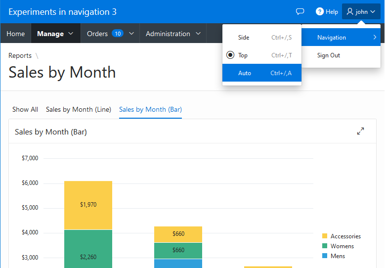
All that remained was to decide when to use the top or side position. I decided to have a menu for the user to choose either Side, Top, or Auto. The auto choice decides based on the screen width. The setting is kept in session storage. There are many different ways to handle this. I added this menu item to the navigation bar user menu. You can see this in the above screen shot. This is pretty standard apex.action and menu customization stuff. I added an extra class, “user-menu-btn” to user menu item in the Navigation Bar List. This made it easier for the code to find the menu and insert an extra sub menu. Keep this example in mind if you are ever trying to get around the limitation of the Navigation Bar list template not supporting sub menus.
For the auto choice I have it switch to side navigation when the screen width is greater than 440px. This uses the new in 20.1 API apex.theme.mq. This function was moved from the theme42 API. The old UT specific function apex.theme42.util.mq should be considered deprecated. You can try the auto setting out on a mobile device with a small screen or most browsers have developer tools that let you simulate a phone for testing.
As I was testing I noticed that some parts of the page were not positioned correctly when switching navigation positions. Specifically sticky widgets, sticky table headers, and regions in the breadcrumb position. The solution was to trigger a refresh event on the window. This handled most cases but I also ended up using an undocumented UT API apex.theme42.util.fixLayout. I think you only need this function if you are using the breadcrumb position. See the updateStickyThings function for details.
The code to change positions is implemented with a radio group action (see the actions interface). The benefits of using an action can be seen in the keyboard shortcuts. For example press Ctrl+/ and then T to set the position to top. Also on the home page there is a radio group styled as pill buttons showing another possible UI in addition to the radio group menu item. This borrows some CSS classes from the toolbar widget to give the radio group a button style.
This example used a normal desktop style menu bar for top navigation. It should be possible to use any kind of custom content mega menu as well.
To sum up:
- Example 1 showed how to put a cards style list in the left side navigation area.
- Example 2 showed how to load side navigation tree nodes on demand when a parent node is expanded.
- Example 3 showed how to dynamically change between side and top navigation at run time.
I hope this series has been interesting and helpful for you. I learned a great deal creating these example apps.
Hi ohn Snyders,,
I have download you cookbook of IG from your latest post.I m new in apex and I m try to your code to sum of IG column in mster detail it work fine on create mode bu it give an issue on edit mode and through jav script error. But if we remove “where clause” on detail part in master detail then it work fine on edit mode also but it show all records in detail part. can you guide me to create a master detail page with IG just like a Tax Invoice and doing a sum of columns and save them in database.
Thanks